Rebranding a 50-year old pool and hot tub store.

Aqua Pacific has been selling and servicing pools and hot tubs in Victoria for 50 years. There have been a few ownership changes along the way but the store has carried on, business as usual. The newest owner, Ma Lin, decided it was time to shake things up a bit and get more competitive.
She brought Brand Intervention into the process at the outset to orchestrate a rebranding and a renovation of the store.
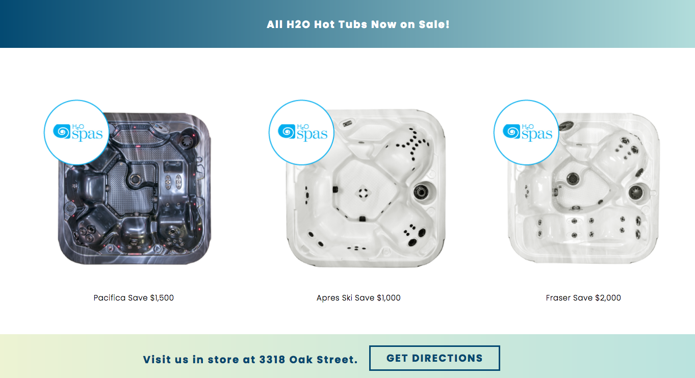
Strategically we wanted to own the “affordable pools and hot tubs” position in the market, with an increased emphasis on the hot tubs.
A new tagline was created to support this:
HELPING VICTORIANS AFFORD THE GOOD LIFE
This re-enforced the aspirational nature of the products, whilst bringing them within reach to more people.
I worked with Megan Munro to nail the visual siding of the branding, which needed a stronger colour palette and an updating of the current logo, rather than something with completely new reference points. The dolphin, a long-time icon, carried forward the history of the business.
OLD LOGO

NEW LOGO

EXTERIOR SIGNAGE BEFORE


EXTERIOR SIGNAGE AFTER


The store was not able to get a permit for an outdoor electronic pylon sign because only one is granted per building, and the building already had one. So we created some sidewalk noise via 11 foot high flags and an over-sized sandwich board.
STREET BRANDING BEFORE AND AFTER

NEW BUSINESS CARDS

INTERIOR
For the interior, we had a small budget to work with and had to be smart and economical with our moves. There was no room for flash and with such a big space, just painting and re-flooring was going to suck up most of the budget.
The goal was to focus on the hot tubs. Hard to do when your store showroom can only accommodate 2 tubs! So we tore down the dry wall that separated the front and back of the store and opened up the space to handle 8 tubs. Immediately the store felt like a showroom.
We used the new brand colours to direct the interior palette, with pale green and vibrant blue replacing the yellow of the old store. The floor needed to be less distracting so the attention could go to the hot tubs, so a neutral colour was chosen for the re-tiling.
Water treatment products were moved away from the tubs to reduce the visual clutter, and were given their own space; potted tropical palms were brought in to warm up the atmosphere. All these moves brightened up the feel of the interior.
INTERIOR BEFORE


INTERIOR AFTER


Ok fine, yes, that is me in some of the pics but a little star power doesn’t hurt, come on!
WEBSITE
We wanted to avoid the homepage design ghetto where most hot tub/pool homepages lived - a big photo of people in a tub. Every decent site looked the same. Instead we wanted something unique that felt authentic to Aqua Pacific, a style they could really own. Designer/developer Megan Munro knocked it out of the park with an inspired and whimsical design that flowed from the logo she had refreshed.
We simplified the navigation to make it easy for customers to find what they want and get to the products fast.
OLD WEBSITE


NEW WEBSITE


You can check out the site here.
A new Facebook page quickly followed the launch of the site.
There are more visual treats coming soon like a 10-foot inflatable dolphin and a 25-foot vinyl wall mural that’s going to look like this:

But for now it’s Christmas, and the store is busy selling amazing presents!
The following contributed their talents and ideas to this rebrand:
Megan Munro Graphic design, website design/development
Rock Paper Square Interior design consulting
Royal Pacific Millworks Interior build
Derek Ford Photography Interior photography
Houston Signs Exterior signage
Garside Signs Sandwich board
MiniMaxMedia Exterior flags and interior signage
Metropol Printing
Brand Intervention Project Management, brand strategy, creative direction, advertising, copywriting, media planning, interior design, social media strategy
