Rebranding a greener cleaner store.

Wes Koch is Victoria’s “Mr. Clean”, a pioneering evangelist in the art of sustainable cleaning.
He’s been the leading voice in the city for over 25 years, and for most of that time his store, The Soap Exchange, has been the only place where conscientious cleaners could find the products and cleaning advice they needed.
In 2018, with new competition signing in to the market, he decided it was time to consider his brand’s image and brought in Brand Intervention to make some recommendations.
First up, we created an online survey to existing customers to be sure their voice was up-front in the process. We learned some key information, including the business’s perceived strengths, the areas for improvement, how the store and website were being viewed and used.
WHAT WE LEARNED
We learned that the loyalty lay most with the customer service (specifically the quality of the advice and the welcoming attitude), and the quality of the products. They trusted the brand and what it delivered. But few used the website and half the respondents felt the store could use a facelift.
Next we analyzed the competitive environment to be clear about the gaps and opportunities. Then, the core team got together at Wes and his wife Kim’s dining table for a Brand Workshop, to tease out the key drivers of the rebrand.
Here’s what was clear: Having the trust of existing customers meant we could really change up the customer experience – visually, functionally and emotionally. As long as the welcoming attitude, solid advice and superior products didn’t change.
We quickly decided there would be no sacred cows other than the name and the presence of the globe in the logo, and we went at the rebrand with gusto. These are the results of those efforts.
It wasn’t always an easy process for Wes, who was invested in the store experience he has long provided for his customers. But to his great credit, he allowed the process to play out and the results are pretty spectacular.
LOGO: AVOID GREEN
The competitive space was awash with the colour green, and you can’t stand out in a field wearing green. So a more human palette was needed here. Wes’s talented sister Lori Koch of Bravo Advertising took on the logo task and found exactly what The Soap Exchange needed on her first round. She re-imagined the earth symbol and the exchange icon and skillfully flowed the two together, giving the store the memorable icon it needed: Our planet is in good hands.

In place of the old green and blue, a warmer colour palette; settled, mature and confident. Then we moved to roll out the new look across the brand’s channels, ensuring that the customer experience was consistent.
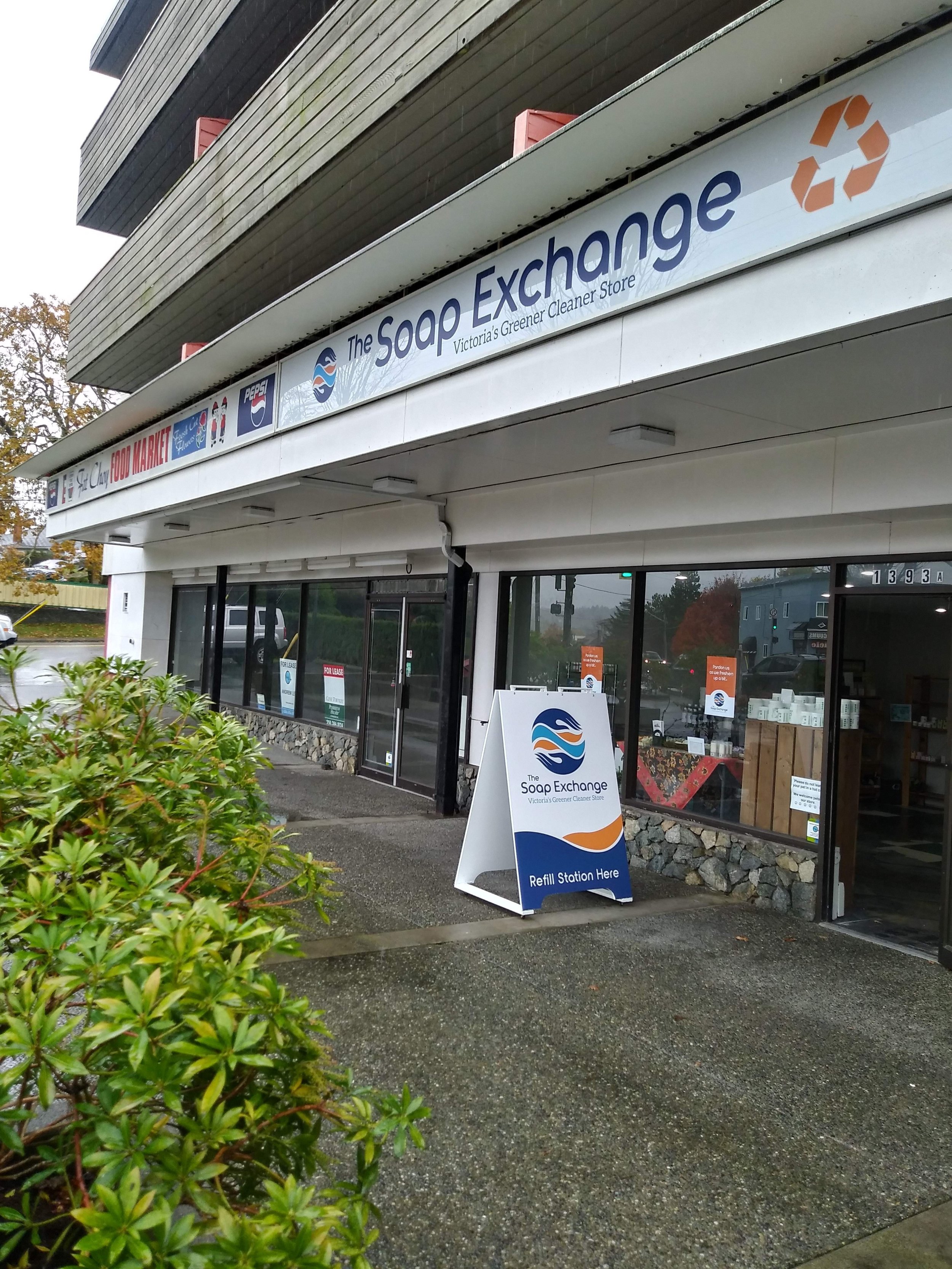
SIGNAGE BEFORE

SIGNAGE AFTER
But it was in the appearance of the store interior where The Soap Exchange brand found its most dramatic retelling.
INTERIOR DESIGN AND BUILD
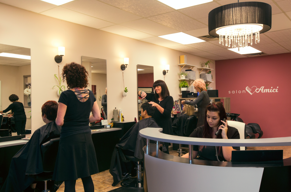
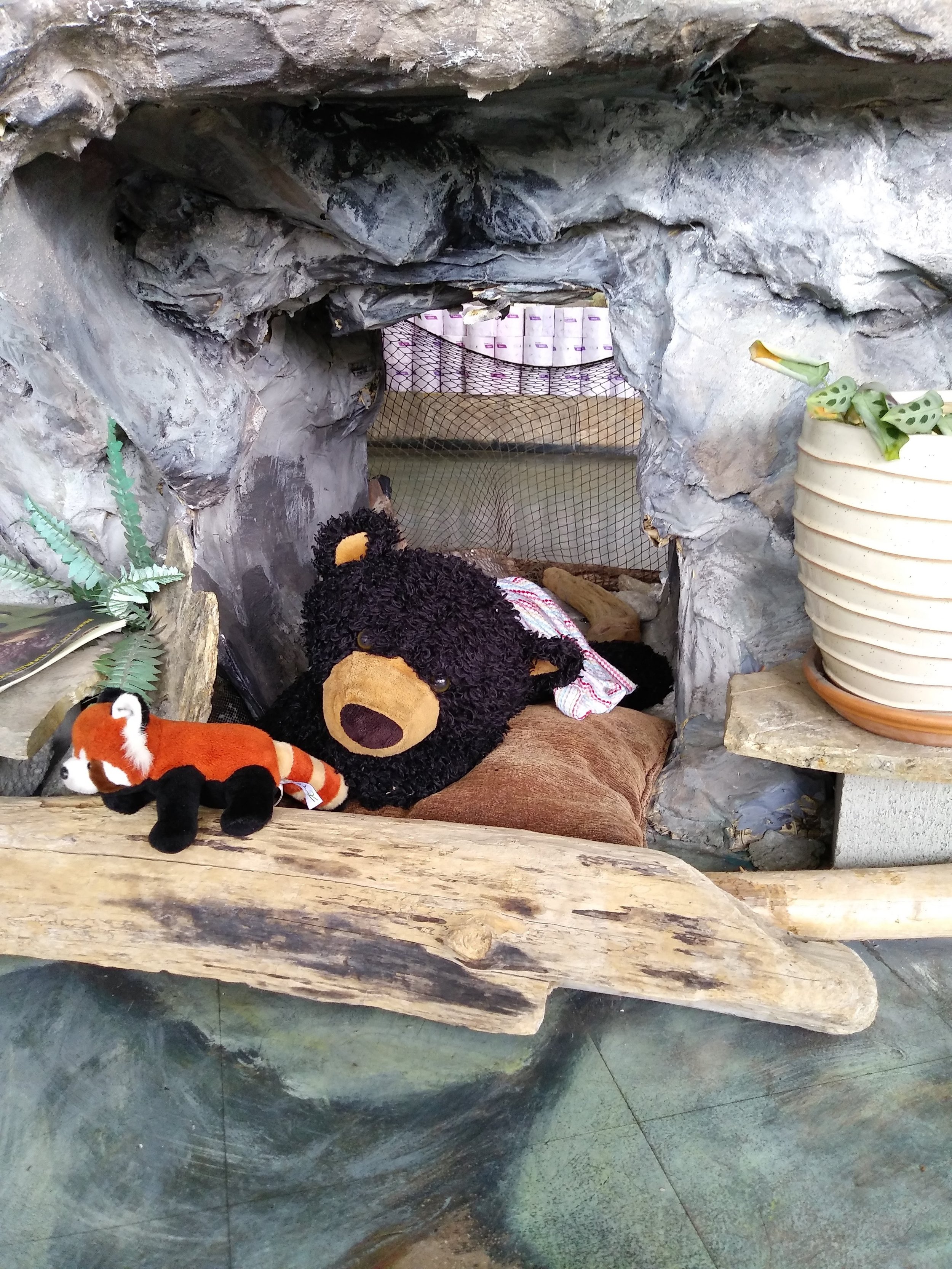
Rock Paper Square’s Marika Beise, who collaborated with Brand Intervention on Salon Amici last year, stepped in and delivered a stunning visual transformation. Gone was the rough-hewn bear cave and the uneven lines of the rock and plaster ledges. Marika moved completely away from the sky ceiling and painted rock floor to create an environment of clean lines, natural surfaces and easy organization. With a striking table at the center as the focal point.
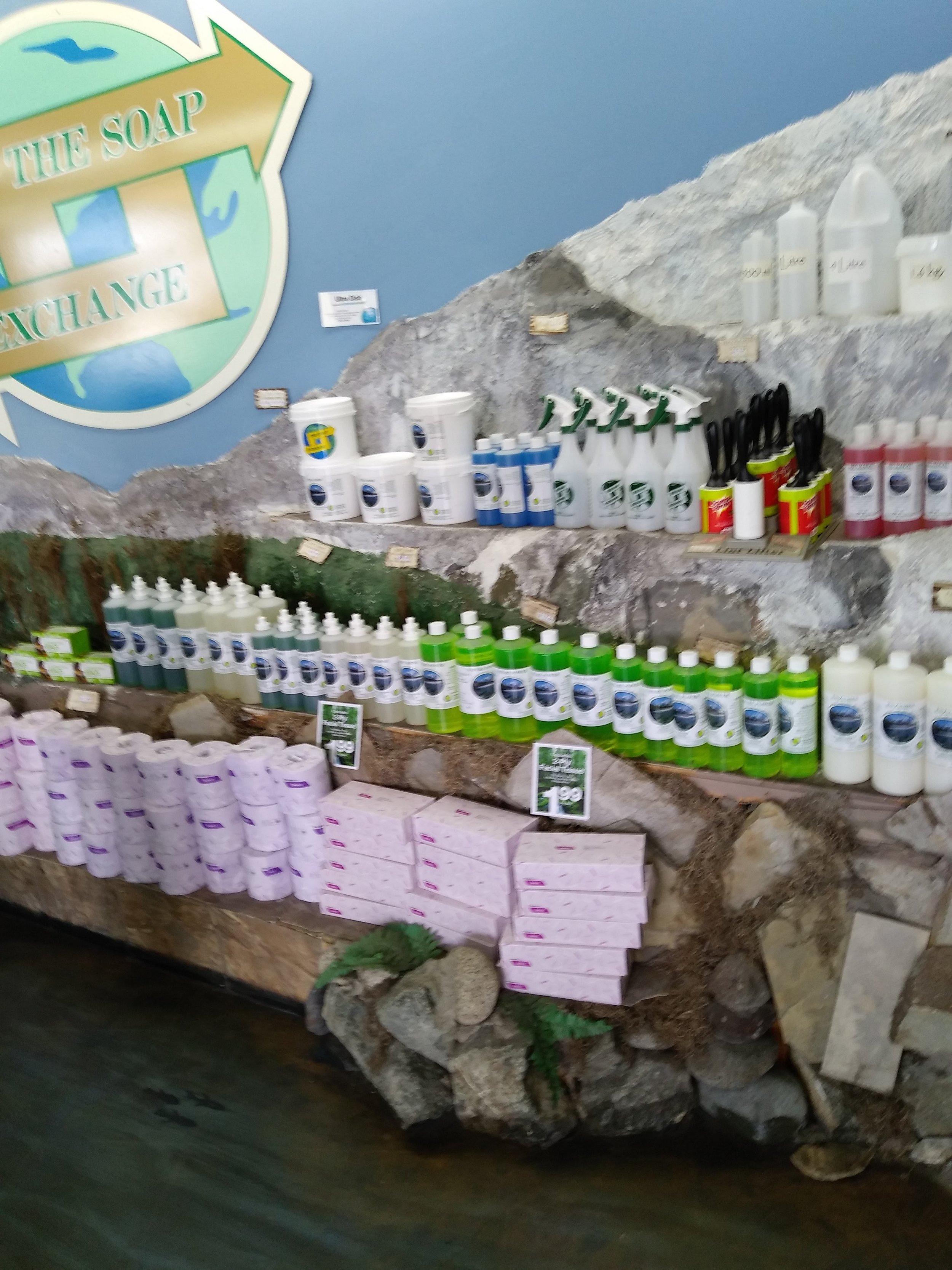
INTERIOR BEFORE

Marika, Wes and Gerry

Work in progress

INTERIOR AFTER


It was cleaner and brighter too – something you would want for Victoria’s greener cleaner store.
The man behind this – the solitary guy who gutted, hauled, built, laid, wired, painted and cleaned this reconstruction was Gerry Burnside. My hat is off.
WINDOW TREATMENT BEFORE AND AFTER


SANDWICH BOARD BEFORE AND AFTER

MAKING THE MOVE TO AN ONLINE STORE
There was compelling evidence for Wes to incorporate E-commerce sales into his business, owing to the physical limitations of having only one store and not much in the way of distribution beyond the city. IdeaZone are designing and developing a new site while The Soap Exchange gathers content.
With the store transformation complete and the website coming up fast, the Victoria Soap Exchange is positioned to attract new customers and build their business.
“Doug provided me with the guidance, clarity and direction I was in such desperate need of,” Wes summarized. “He also assisted greatly in convincing me to let go of some of my perceptions as well as my tunnel vision.”
THE REBRAND TEAM
Lori Koch, Bravo Advertising – logo re-design
Idea Zone – website design and development
Marika Beise, Rock Paper Square – interior design
Gerry Burnside - construction
Megan Munro – graphic design
Triad Sign – backlit exterior signage
Mini Max Media – window decals
Garside – Sandwich board
Brand Intervention – project lead, brand strategy, creative direction
Special thanks to The Soap Exchange support team: Sharon Tiffin & Kim Ott, and Brittany Gamble from the Good Planet Company.