
Up to my old branding tricks in 2021, Covid be damned.
Read More
Rebranding a business with a competitive edge
After 15 years in business, Scholars Edge was being outspent and outshone as a brand. Here’s how we turned it around.
Read More2018: The year in pictures
Up to my usual tricks in rebranding and advertising the past year.

2018 was the busiest year yet at Brand Intervention: 7 rebrands, 4 new business brands, countless ads. Here are some of the highlights:

I worked with Leap on the Story rebrand. Their site went live early in the year.

First ad for Triple Bar Construction fresh out of a rebrand

Robbins VIP Parking ad for Victoria Royals hockey games

Ad for The Raptors’ big 2018 initiative

Fort Street Cycle’s lamp post ad on a lamp post

Brand Interventionist assisting on McEwen Financial photoshoot. Photo credit Katie Nelson

The Soap Exchange rebrand included a dramatic logo transformation

One of the EAT magazine campaign ads for the Blue Heron Advisory Group

Ad for Gold Hill Winery, living up to their name throughout the year’s wine awards shows.

New name, tagline and logo for an international corporate turnaround specialist - Michael Tension designing

Ad for the cuddliest birds at The Raptors Visitor Centre

Rebrand of Aqua Pacific includes killer website design by Megan Munro

Facebook campaign for The Athlete Centre using customer insight!

Method acting from the Brand Interventionist. Photo by Derek Ford
My sincere thanks to my collaborators this year! They include:
Megan Munro- graphic design, website design/development
Michael Tension – graphic design
Caroline and Jessica at Design Coast - graphic design
Mike Kirk – website design and development
Kathleen Sato - graphic design
Lori Koch at Bravo Advertising – graphic design
Leap XD – website design and development
Derek Ford - photography
Katie Nelson – photography
Marika Beise at Rock Paper Square – interior design
Jazz Chodak – social media management
MiniMax Media – graphics
Garside - graphics
Houston Sign – signage
WISHING ALL A BRILLIANT 2019!
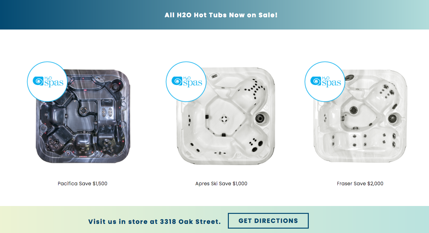
The refreshing of Aqua Pacific
Rebranding a 50-year old pool and hot tub store.

Aqua Pacific has been selling and servicing pools and hot tubs in Victoria for 50 years. There have been a few ownership changes along the way but the store has carried on, business as usual. The newest owner, Ma Lin, decided it was time to shake things up a bit and get more competitive.
She brought Brand Intervention into the process at the outset to orchestrate a rebranding and a renovation of the store.
Strategically we wanted to own the “affordable pools and hot tubs” position in the market, with an increased emphasis on the hot tubs.
A new tagline was created to support this:
HELPING VICTORIANS AFFORD THE GOOD LIFE
This re-enforced the aspirational nature of the products, whilst bringing them within reach to more people.
I worked with Megan Munro to nail the visual siding of the branding, which needed a stronger colour palette and an updating of the current logo, rather than something with completely new reference points. The dolphin, a long-time icon, carried forward the history of the business.
OLD LOGO

NEW LOGO

EXTERIOR SIGNAGE BEFORE


EXTERIOR SIGNAGE AFTER


The store was not able to get a permit for an outdoor electronic pylon sign because only one is granted per building, and the building already had one. So we created some sidewalk noise via 11 foot high flags and an over-sized sandwich board.
STREET BRANDING BEFORE AND AFTER

NEW BUSINESS CARDS

INTERIOR
For the interior, we had a small budget to work with and had to be smart and economical with our moves. There was no room for flash and with such a big space, just painting and re-flooring was going to suck up most of the budget.
The goal was to focus on the hot tubs. Hard to do when your store showroom can only accommodate 2 tubs! So we tore down the dry wall that separated the front and back of the store and opened up the space to handle 8 tubs. Immediately the store felt like a showroom.
We used the new brand colours to direct the interior palette, with pale green and vibrant blue replacing the yellow of the old store. The floor needed to be less distracting so the attention could go to the hot tubs, so a neutral colour was chosen for the re-tiling.
Water treatment products were moved away from the tubs to reduce the visual clutter, and were given their own space; potted tropical palms were brought in to warm up the atmosphere. All these moves brightened up the feel of the interior.
INTERIOR BEFORE


INTERIOR AFTER


Ok fine, yes, that is me in some of the pics but a little star power doesn’t hurt, come on!
WEBSITE
We wanted to avoid the homepage design ghetto where most hot tub/pool homepages lived - a big photo of people in a tub. Every decent site looked the same. Instead we wanted something unique that felt authentic to Aqua Pacific, a style they could really own. Designer/developer Megan Munro knocked it out of the park with an inspired and whimsical design that flowed from the logo she had refreshed.
We simplified the navigation to make it easy for customers to find what they want and get to the products fast.
OLD WEBSITE


NEW WEBSITE


You can check out the site here.
A new Facebook page quickly followed the launch of the site.
There are more visual treats coming soon like a 10-foot inflatable dolphin and a 25-foot vinyl wall mural that’s going to look like this:

But for now it’s Christmas, and the store is busy selling amazing presents!
The following contributed their talents and ideas to this rebrand:
Megan Munro Graphic design, website design/development
Rock Paper Square Interior design consulting
Royal Pacific Millworks Interior build
Derek Ford Photography Interior photography
Houston Signs Exterior signage
Garside Signs Sandwich board
MiniMaxMedia Exterior flags and interior signage
Metropol Printing
Brand Intervention Project Management, brand strategy, creative direction, advertising, copywriting, media planning, interior design, social media strategy

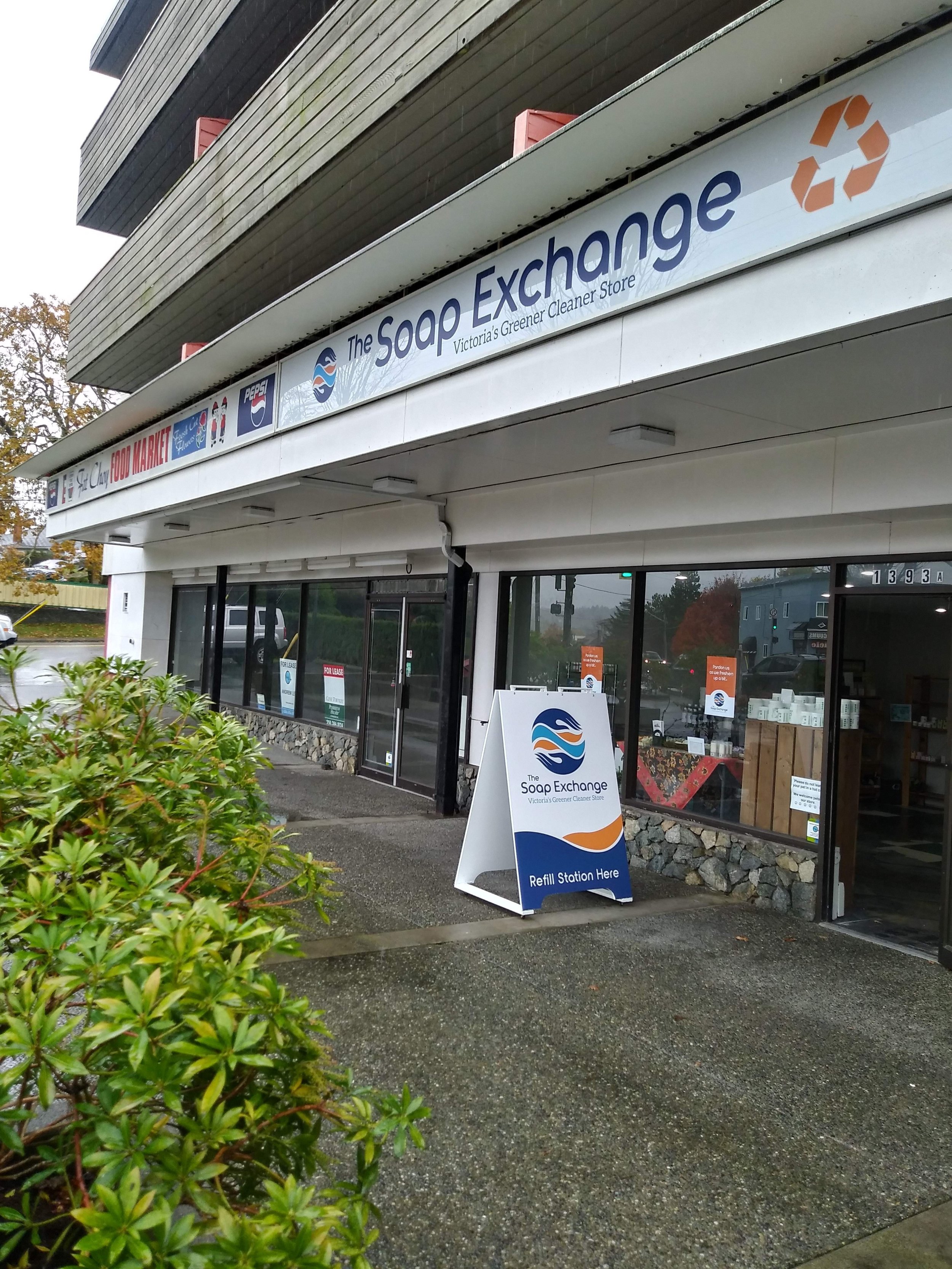
Changing it up at the Victoria Soap Exchange
Rebranding a greener cleaner store.

Wes Koch is Victoria’s “Mr. Clean”, a pioneering evangelist in the art of sustainable cleaning.
He’s been the leading voice in the city for over 25 years, and for most of that time his store, The Soap Exchange, has been the only place where conscientious cleaners could find the products and cleaning advice they needed.
In 2018, with new competition signing in to the market, he decided it was time to consider his brand’s image and brought in Brand Intervention to make some recommendations.
First up, we created an online survey to existing customers to be sure their voice was up-front in the process. We learned some key information, including the business’s perceived strengths, the areas for improvement, how the store and website were being viewed and used.
WHAT WE LEARNED
We learned that the loyalty lay most with the customer service (specifically the quality of the advice and the welcoming attitude), and the quality of the products. They trusted the brand and what it delivered. But few used the website and half the respondents felt the store could use a facelift.
Next we analyzed the competitive environment to be clear about the gaps and opportunities. Then, the core team got together at Wes and his wife Kim’s dining table for a Brand Workshop, to tease out the key drivers of the rebrand.
Here’s what was clear: Having the trust of existing customers meant we could really change up the customer experience – visually, functionally and emotionally. As long as the welcoming attitude, solid advice and superior products didn’t change.
We quickly decided there would be no sacred cows other than the name and the presence of the globe in the logo, and we went at the rebrand with gusto. These are the results of those efforts.
It wasn’t always an easy process for Wes, who was invested in the store experience he has long provided for his customers. But to his great credit, he allowed the process to play out and the results are pretty spectacular.
LOGO: AVOID GREEN
The competitive space was awash with the colour green, and you can’t stand out in a field wearing green. So a more human palette was needed here. Wes’s talented sister Lori Koch of Bravo Advertising took on the logo task and found exactly what The Soap Exchange needed on her first round. She re-imagined the earth symbol and the exchange icon and skillfully flowed the two together, giving the store the memorable icon it needed: Our planet is in good hands.

In place of the old green and blue, a warmer colour palette; settled, mature and confident. Then we moved to roll out the new look across the brand’s channels, ensuring that the customer experience was consistent.
SIGNAGE BEFORE

SIGNAGE AFTER
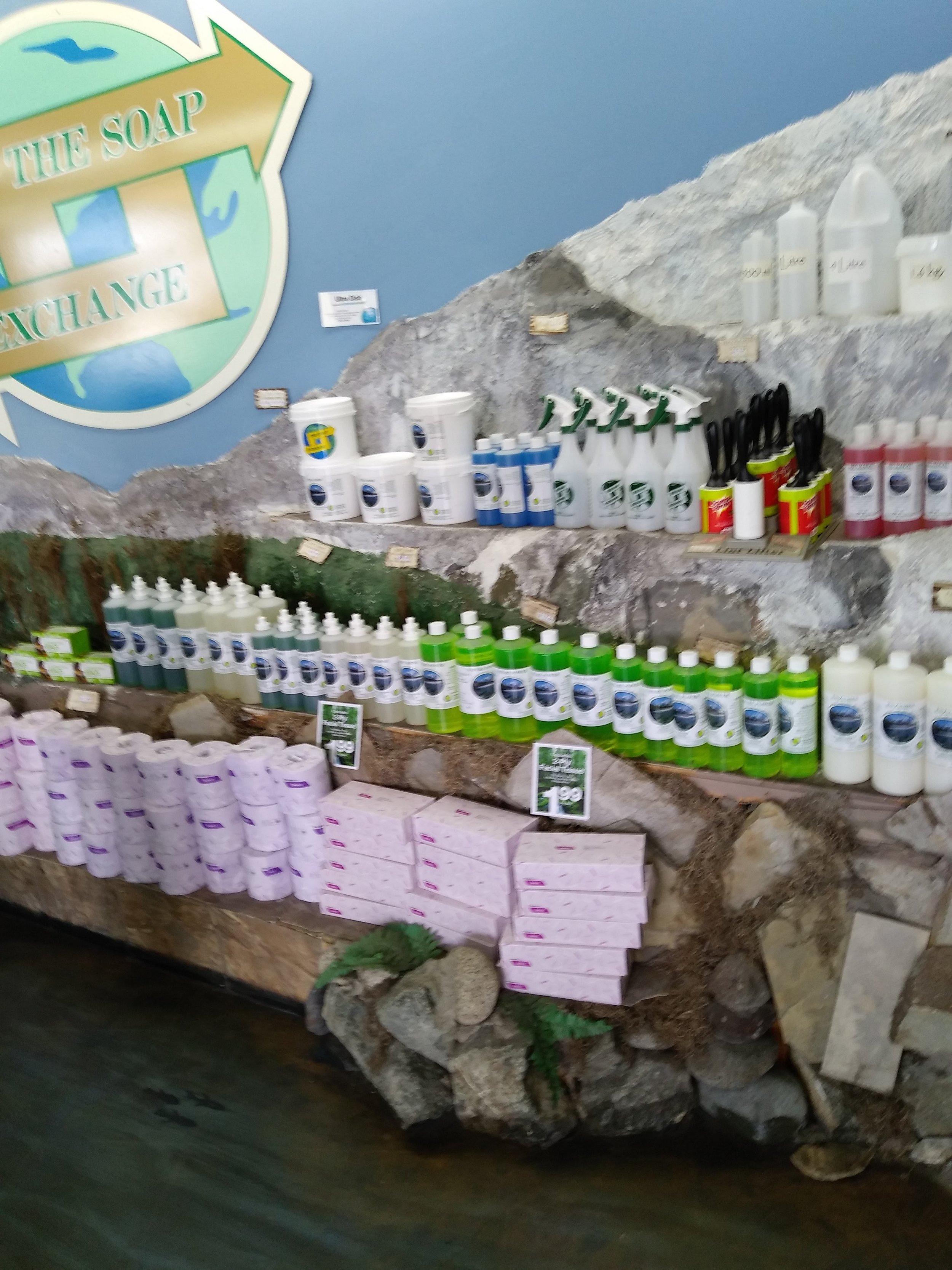
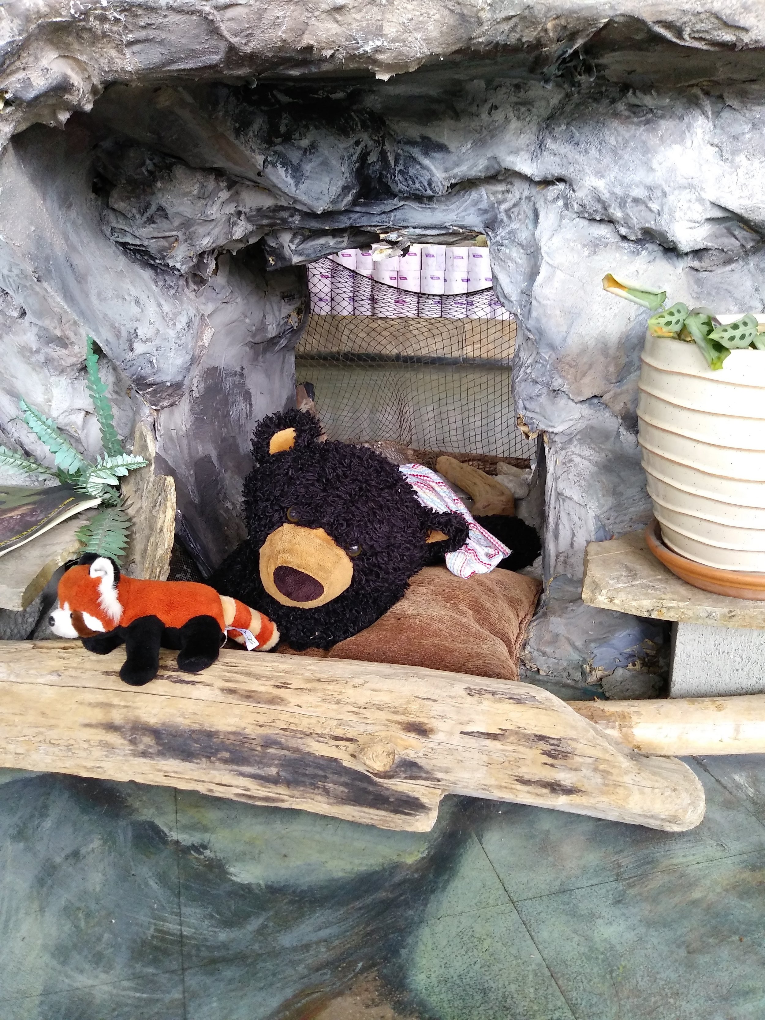
But it was in the appearance of the store interior where The Soap Exchange brand found its most dramatic retelling.
INTERIOR DESIGN AND BUILD
Rock Paper Square’s Marika Beise, who collaborated with Brand Intervention on Salon Amici last year, stepped in and delivered a stunning visual transformation. Gone was the rough-hewn bear cave and the uneven lines of the rock and plaster ledges. Marika moved completely away from the sky ceiling and painted rock floor to create an environment of clean lines, natural surfaces and easy organization. With a striking table at the center as the focal point.
INTERIOR BEFORE

Marika, Wes and Gerry

Work in progress

INTERIOR AFTER


It was cleaner and brighter too – something you would want for Victoria’s greener cleaner store.
The man behind this – the solitary guy who gutted, hauled, built, laid, wired, painted and cleaned this reconstruction was Gerry Burnside. My hat is off.
WINDOW TREATMENT BEFORE AND AFTER


SANDWICH BOARD BEFORE AND AFTER

MAKING THE MOVE TO AN ONLINE STORE
There was compelling evidence for Wes to incorporate E-commerce sales into his business, owing to the physical limitations of having only one store and not much in the way of distribution beyond the city. IdeaZone are designing and developing a new site while The Soap Exchange gathers content.
With the store transformation complete and the website coming up fast, the Victoria Soap Exchange is positioned to attract new customers and build their business.
“Doug provided me with the guidance, clarity and direction I was in such desperate need of,” Wes summarized. “He also assisted greatly in convincing me to let go of some of my perceptions as well as my tunnel vision.”
THE REBRAND TEAM
Lori Koch, Bravo Advertising – logo re-design
Idea Zone – website design and development
Marika Beise, Rock Paper Square – interior design
Gerry Burnside - construction
Megan Munro – graphic design
Triad Sign – backlit exterior signage
Mini Max Media – window decals
Garside – Sandwich board
Brand Intervention – project lead, brand strategy, creative direction
Special thanks to The Soap Exchange support team: Sharon Tiffin & Kim Ott, and Brittany Gamble from the Good Planet Company.

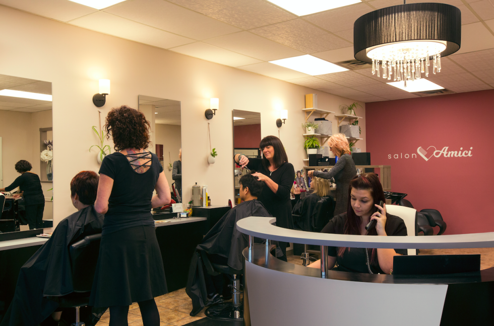
Restyling a Victoria hair salon
Buying a business is daunting enough. Doing it in a new country where you don’t yet speak the language is a Netflix series.
You have to take a lot of people you don’t know – and can’t really understand – at their word.
Fortunately Liu Ping, the new owner of Royal Oak’s Salon Amici, got lucky. Helping her navigate the ownership transition – plus a significant rebrand and renovation – were the two former owners, now the Salon’s senior stylists.
The chemistry and camaraderie between these 3 ladies lies at the heart of this rebrand.
THE SPIRIT OF AMICI

Maggie Mackay and Praveena Charan opened the Salon’s doors in 1998. They named it Amici (friend in Italian) as a tribute to their own friendship. But twenty years owning a business can be a grind and they were only too happy when Liu Ping bought their company. In the spirit of friendship, they have been with Ping every step of the way as the Salon has undergone a comprehensive refresh.
Brand Intervention was engaged to provide a clear strategic direction and a fresh face (the Salon’s face, not mine!), and line up the team that would transform the interior.
A Brand Workshop with the Salon staff kicked off the process and pointed us in the right direction: We needed to more fully embrace Amici, and warm up the environment.

Doing online surveys gave us a clear sense of visitor expectations, and told us how far people would travel to see their stylist, which helped us nail down our marketing territory as well.
A FRESH NEW STYLE
Graphic designer Megan Munro provided a stellar refreshing of the logo and brought a signature colour palette into play.
OLD LOOK

NEW LOOK

We soon had our physical brand ready to roll with a new website, business cards, brochures and social media pages.

Enter interior designer Marika Beise of Rock Paper Square. She took in the brand essence and responded with a design upgrade that brought a visually warm welcome to complement the human one. Strong Construction provided the building savvy.
OLD INTERIOR

NEW INTERIOR


Urban Sign transformed the exterior of the Salon with overhead signage and sandwich boards.
EXTERIOR SIGNAGE BEFORE/AFTER

The final touch was bringing in Derek Ford to capture the newly branded salon – and it’s re-emphasized spirit – in photos, many of which you see in this post.
I’ve worked on a lot of rebrands, but never before one where the spirit of the team was ultimately the brand strategy. Talk about living your brand. Thank you ladies of Salon Amici!
